Event Vendor Management Platform
Helping organizers manage over 600+ artists for artist alley
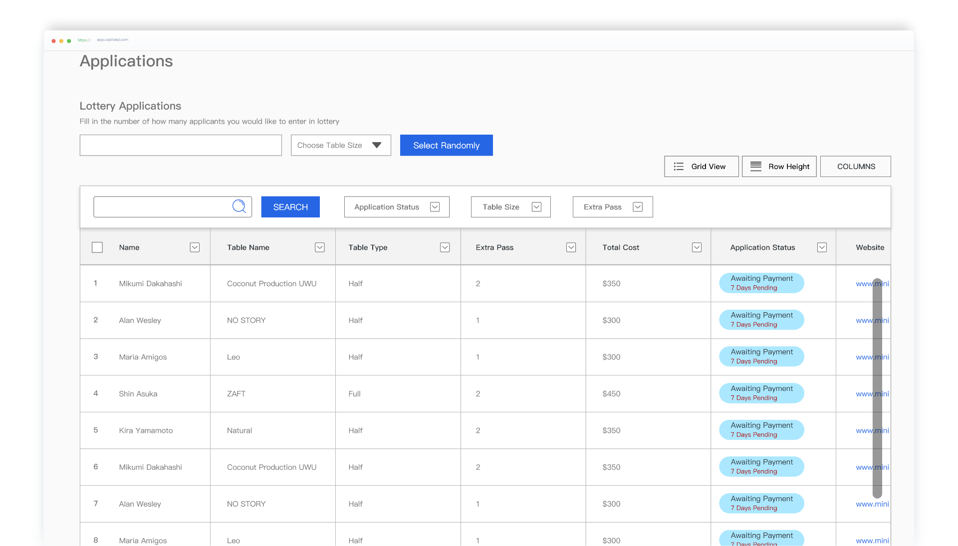
Helping organizers manage over 600+ artists for artist alley

UX/UI + User Research + Content Strategy
This is my Graduation Project for Emily Carr University. This is a
2 part project.
1. Making artist alley applications easier
2. Helping organizers to manage artist alley applications better
You can view artist side here
Managing 600+ artist applications for your artist alley can get chaotic. Contacting artists, moving them off waitlists and obtaining payments are just some of their issues. A bad experience for organizers also means more anxiety for the artists.
To create a better experience for organizers trying to manage hundreds of artist applications.
Anime convention organizers are all volunteers with a full time job. They are extremely limited on time. Many conventions still use a manual way of applications.
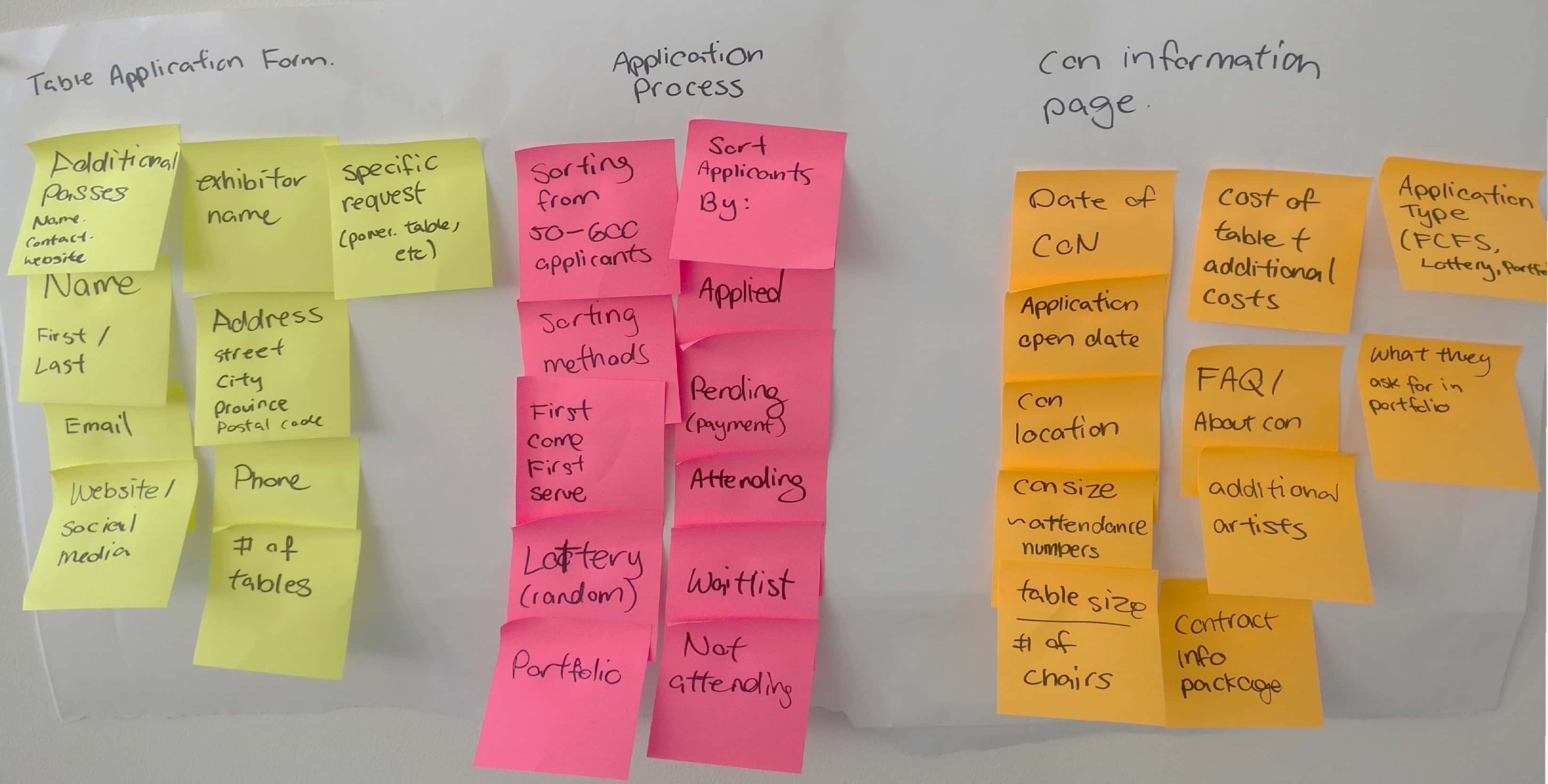
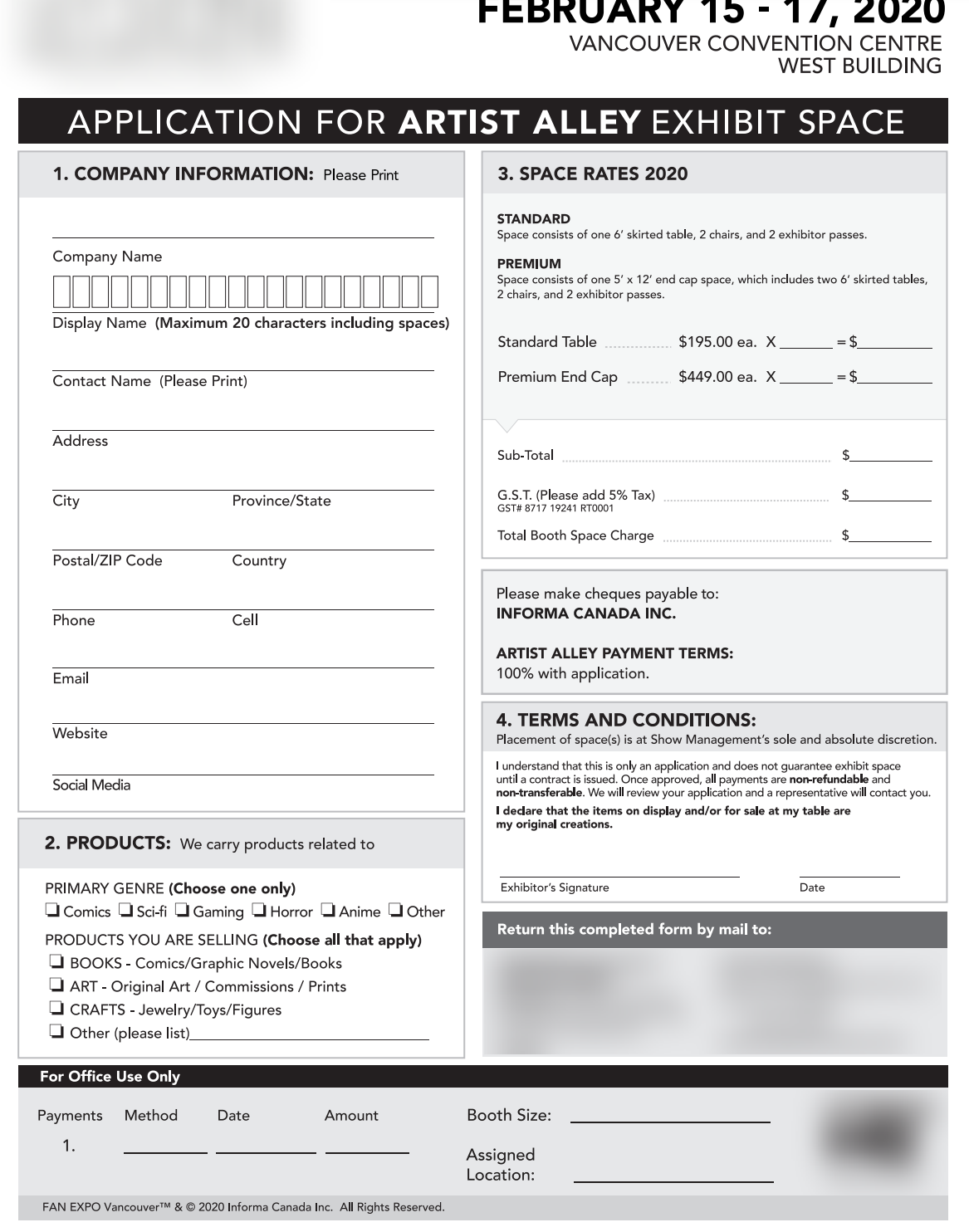
I started the project by interviewing several artists and organizers. I also at different application forms and applied to some conventions myself. I created an affinity map with the information that I obtained from them.
Key learnings out of my primary research:
1. Understanding the logistic complexity of event planning (venue, spacing, insurance, coordination, etc)
2. Understanding who my personas are
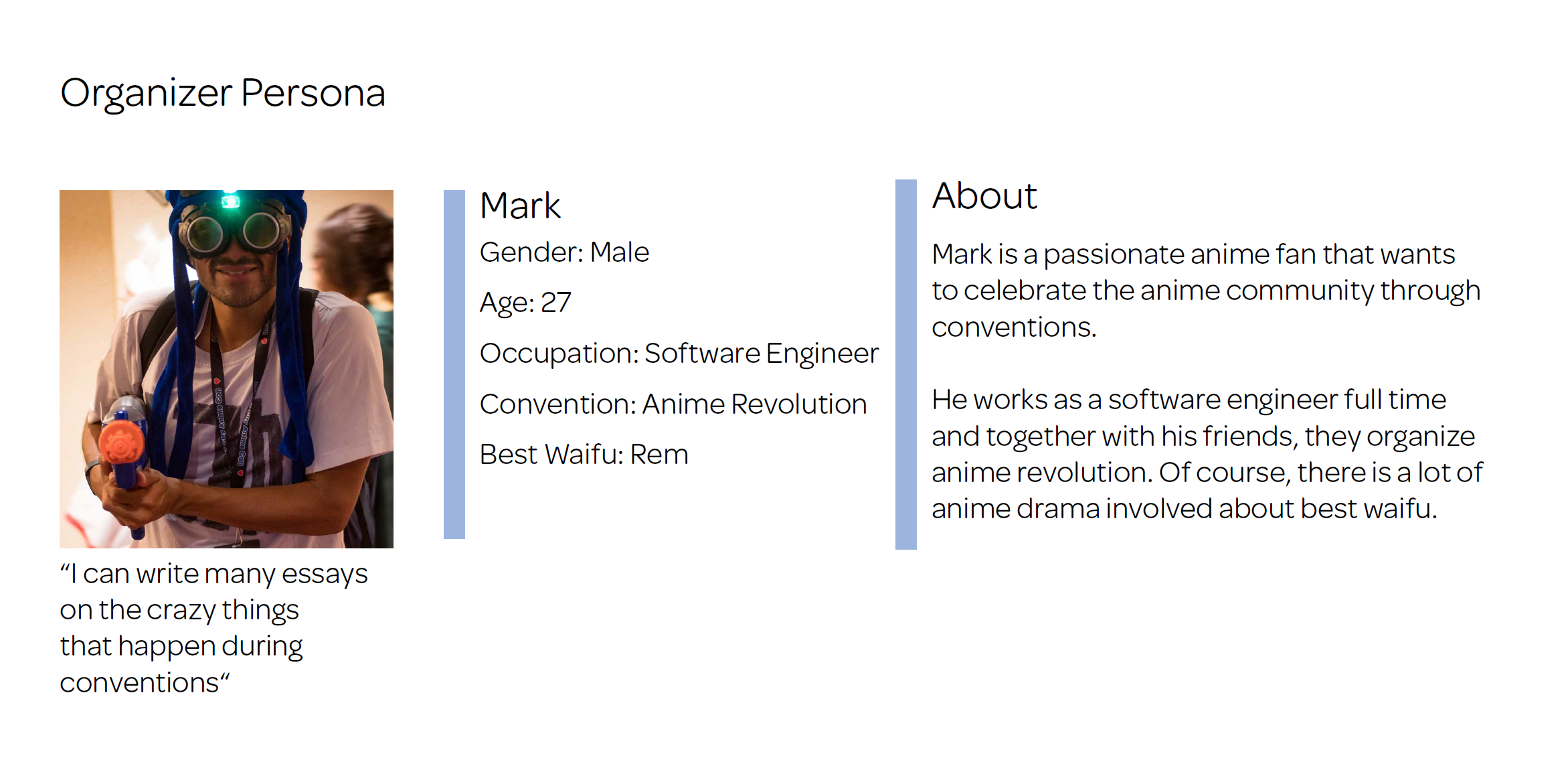
I was define what anime organizer personas look like. Key learning is that a lot of these people have full time jobs outside of event planning and are doing this out of passion. This makes their time extremely valuable.

I was able to create a user flow that helped me better understand how organizers currently handled applications
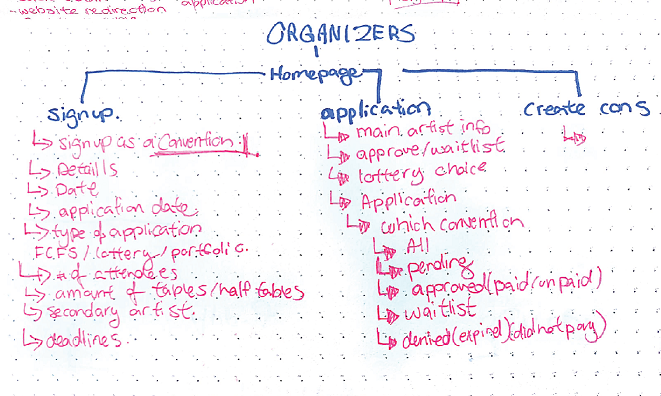
Organizing a convention is a very heavy on logistical task. I listed out the logistic data and features that organizers will need to manage a convention
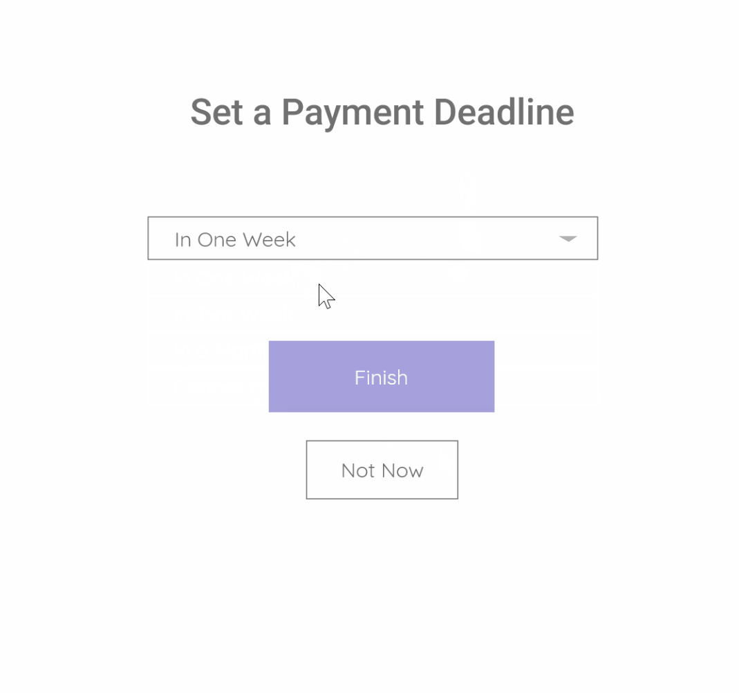
Things like: randomizer for lottery applications, application status, setting a payment deadline for artists, & automating a waitlist process
If tables were sold traditionally, first come first serve, the tables would sell out as fast as in 10 seconds or less. Organizers tend to do lottery applications as it's more fair to those with mobility disability and those who work in the service industry.
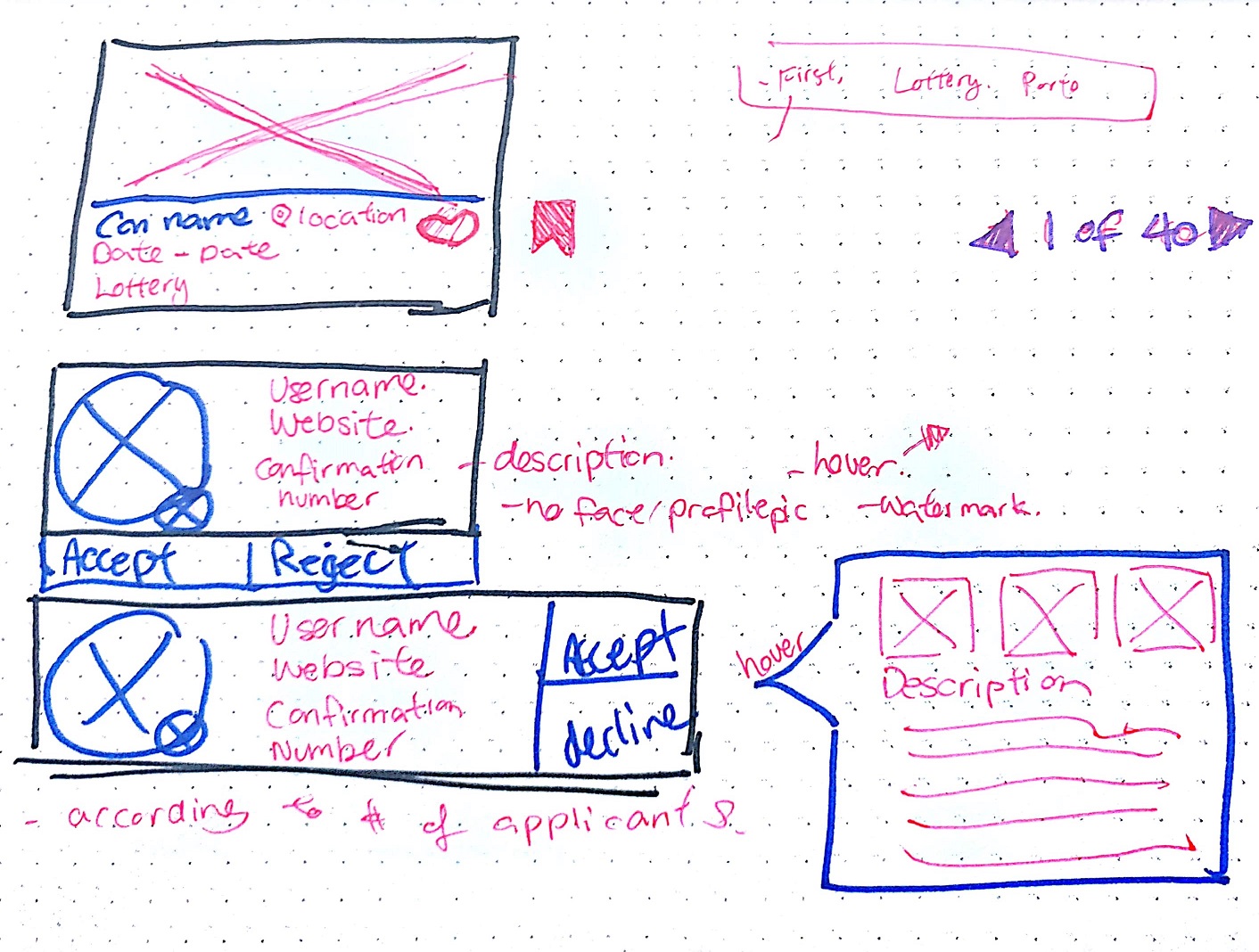
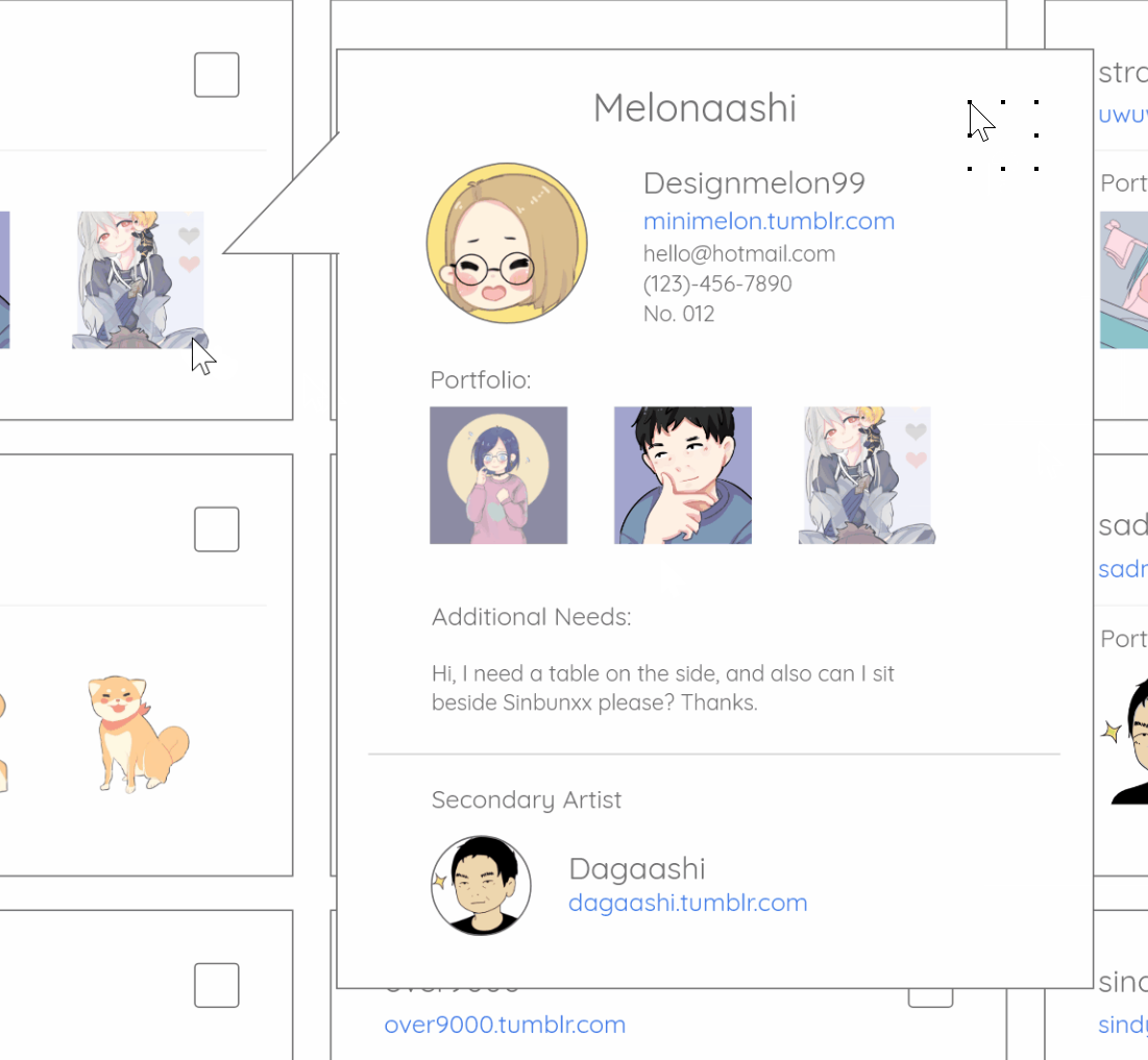
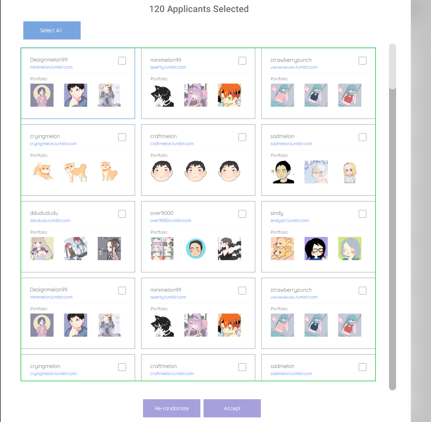
Upon my first user testing session with an organizer, I realized
that my entire design was assumption focused and was not solving the organizer's problems. I was only
thinking about the artist's perspective with the need to see their portfolios and websites, I did not
occur to me that logistic information was far more imporant to organizers.
Turns out: Organizers don't really care about what you create, nor your skill level.
Upon digging futher, I learned that the information organizers
actually care about are the things related to event organizing
like:
1. Table size that the artist choose
2. Managing the application status of the artists
3. Understanding the cost of order, total cost and setting deadlines
4. They want to see & process a massive amount of information at a high level. Like a spreadsheet
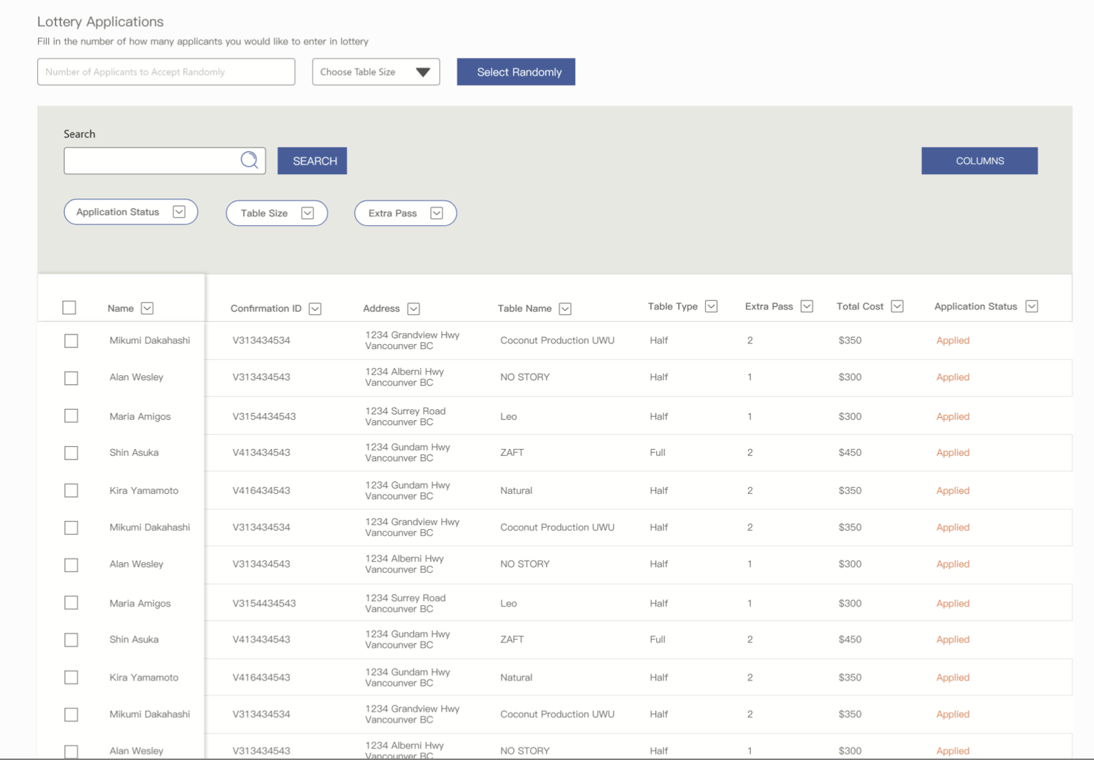
I made the changes based on organizer feedback and proceeded to get more feedback from organizers but also tech professionals
I was able to see the "AHA moment" in the reactions of the organizers. They told me this would make an incredible impact to their day to day workflow.
Otherwise, there was still improvements to the user interface I was able to make to help users view information easier. I was recommended to look into Airtable
My key accomplishments through this project is:
1. Getting the AHA moment out of multiple different artist alley organizers
2. Impressed the former CEO of Picatic, and was invited to their office.
3. Could save WEEKS of organizer time managing applications
The hardest part about this project was learning how I could sort through 600+ applications without looking like a huge mess. What I learned was that spreadsheets are an amazing way to keep track of a massive amount of information.
Working on this allowed me to better understand the challenges of responsive design.
When I conducted my first user test on the organizers, it was clear I didn't create what they needed. In fact, my entire design direction was wrong. Through feedback, I was able to create something the organizers needed than what I thought they needed.