CoPilot AI
Ensuring the user experience of lauching a new product: CoPilot Pro
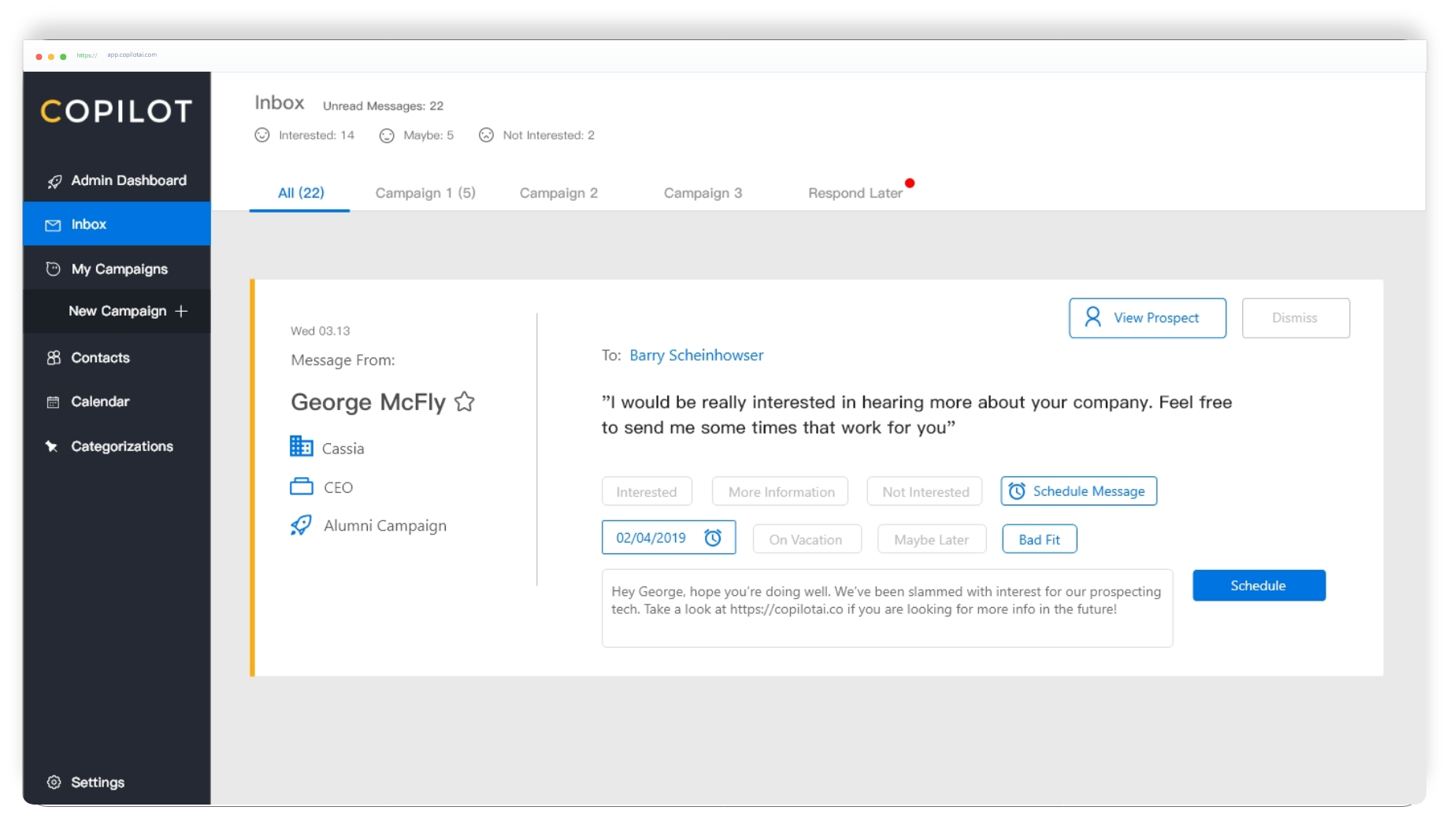
Ensuring the user experience of lauching a new product: CoPilot Pro

Product Design, Usability Testing
CoPilot AI is a LinkedIn automation software that helps users generate leads. This is done in my design internship. I worked with the Lead Product Designer, Sales Team, Customer Success and Developers.
CoPilot AI is moving to a new platform with an entirely new user interface. Since our users are mostly non-tech literate users, we must ensure the our the onboarding process, user experience and key userflow (Inbox) is easy to use.
Redesigning the new platform that is easier for the users but also more efficient for employees during onboarding. Improving the issue in the old platform.
Copilot AI is a service that automates the process of social prospecting through Linkedin. It uses AI to separate message obtained into different categories, which allows users to respond to messages and manage leads.
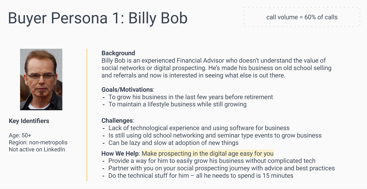
I started by understanding who our key users are.
Our key users are financial advisors who have done things the old school way and are now exploring new options. Social prospecting is significantly different from the walk-in and referrals, which is why our users have a hard time adjusting.
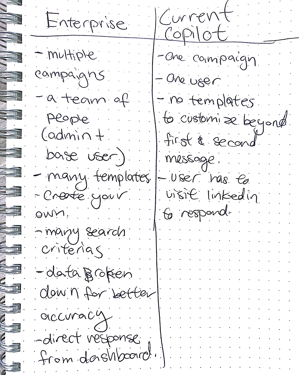
As we are changing to a new platform, it’s crucial to understand the differences, where we are improving and what problems we are solving from the old platform. What are the painpoints and what's new about the new platform.
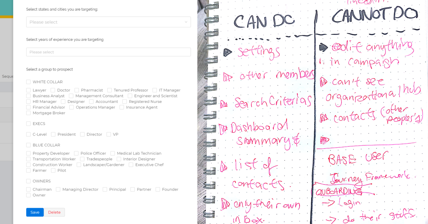
I looked at the different user roles and the parts of the onboarding process that could be improved
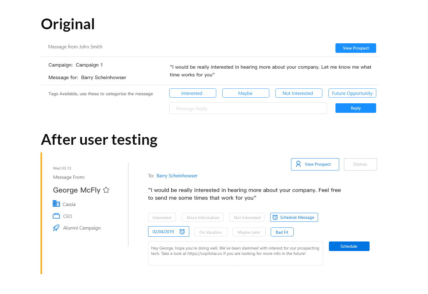
After doing user testing, I realized the message tiles the user responded to messages on was missing key information like: their lead's company and their job title.
The user heavily rely on that information to determine how they respond.
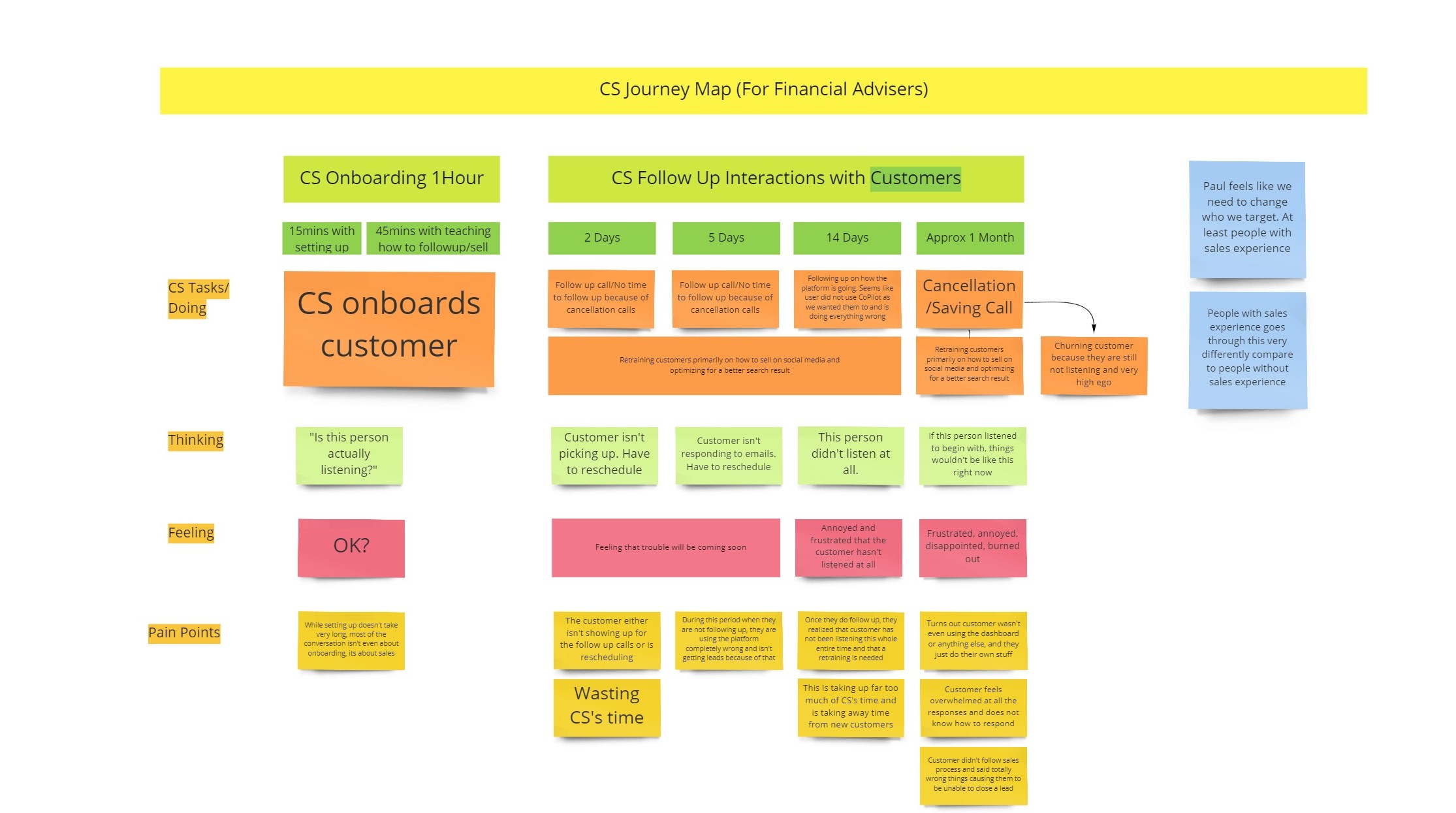
After interviewing the sales and the customer success team, I was able to get the customer experience of the user journey.
I discovered that there was a high amount of customers who end up churning after the onboarding process due to not knowing how to sell through social media. This was extremely useful information as I was redesigning the onboarding process.
I learned how to be a team player with developers while designing. Before I was eyeballing my designs but later learned that when handing off designs, the padding and measurements should be accurate and consistent
When you need a quick user testing, the people who knows customer best is customer success and sales. Not only were they able to give amazing feedback, they are also able to give more insight on personas that I couldn’t achieve alone.
My experience with CoPilot AI was great because they are not afraid to experiment and fail fast. Which meant they are constantly changing their direction including users. I had to adapt quickly to catch up.
Copilot AI’s key userflow is quite straightforward however the onboarding process is tedious and hefty. I really under valued the importance of onboarding prior to CoPilot AI.